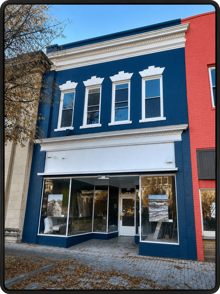
There is something deeply encouraging about watching another Main Street building come back to life. Today this recently restored building stands with an elegance that immediately catches your eye. Its rich dark façade, crisp white trim, and restored storefront remind us that good architecture never truly disappears. It only waits for someone to see its value again.
One of the things I have been trying to do through this series, “Learning to Speak the Language of Main Street Architecture,” is to train my own eyes to notice the details older builders once considered important. They were not simply boxes for commerce. They were statements about a growing town and the people who believed in its future.
This building speaks that language beautifully.
Like many traditional downtown commercial buildings across North Carolina, the structure follows the classic Main Street formula: storefront below, offices or living space above, and an ornamental crown at the roofline. Though simple at first glance, every part of the façade was carefully composed to create balance and rhythm along the street.
The ground floor still retains the large storefront windows that once invited pedestrians to stop and look inside. Historic downtown architecture was built for people walking the sidewalks. The storefront glass acted almost like a display case to the street itself. Even today the transparency of those windows creates warmth and life at the pedestrian level.
The recessed entrance is another surviving detail that gives the building authenticity. Older Main Street storefronts often stepped the doorway back from the sidewalk, creating shelter from rain and giving shoppers a moment to pause before entering. It also allowed merchants additional angled display space beside the entry. Details like this were practical, but they also created charm and human scale.
Above the storefront, the second story reveals the building’s strongest architectural character. The tall narrow windows immediately suggest the influence of Italianate commercial design, a style that became enormously popular in American downtowns during the late nineteenth century. These windows stretch vertically, drawing the eye upward and giving the façade a graceful proportion that modern buildings often lack.
What I especially love are the decorative white window crowns above each opening. These raised masonry details add texture and shadow to the brick surface and prevent the upper façade from appearing flat or lifeless. Even modest downtown buildings once included ornament because builders understood that beauty mattered in everyday life. The decorative trim surrounding the windows adds further refinement and creates striking contrast against the dark painted brick.
Then there is the cornice.
Every time I study an old Main Street building I come back to the importance of the cornice because it acts as the architectural “hat” of the building. Here the projecting cornice line, accented with delicate dentil detailing beneath it, gives the entire façade completion and dignity. Those repeating decorative blocks may seem minor to modern eyes, but they connect this building to centuries of classical architectural tradition. Such details once communicated stability and craftsmanship.
The parapet rising above the roofline also reminds us how historic commercial architecture often worked a little like stage scenery. Behind the façade the building itself may have been straightforward and practical, but the street-facing front was designed to present a handsome public image to the community. Main Street merchants understood that appearance mattered because downtown represented the identity of the town itself.
Architecture does have a language, and once you begin learning the vocabulary you start seeing far more than brick and windows. You begin seeing intention, craftsmanship, proportion, and the values of the people who built these downtowns generations ago.
This building would best be described as a “Late Italianate Commercial with a Modernized Storefront.” The clues are there once you know how to recognize them: the tall narrow windows, the decorative window hoods, the projecting cornice, the masonry ornamentation, and the strong vertical proportions that pull your eyes upward toward the roofline.
The storefront itself was simplified and updated sometime during the mid-century years when many downtown buildings across America were modernized between the 1940s and 1970s. Fortunately, unlike some buildings, this one never lost its architectural bones. Beneath the changes the original character survived, waiting for restoration to reveal it once again.
Buildings like this are so valuable.
They preserve craftsmanship. They preserve proportion. They preserve human-scaled design, traditional urbanism, and the visual continuity that gives Main Street its identity.
The more I study Main Street architecture the more I realize these buildings remind us that beauty once mattered in everyday life, that downtowns were built to inspire pride, and that even commercial buildings were expected to contribute something graceful and lasting to the community around them.
And that, I think, is exactly the language of Main Street.
Stepheny Forgue Houghtlin grew up in Evanston, IL. and is a graduate of the University of Kentucky. She is an author of two novels: The Greening of a Heart and Facing East. She lives, writes and gardens in NC. Visit her: Stephenyhoughtlin.com
View all posts by Stepheny Forgue Houghtlin